

Overview
Composer is an open-source design system crafted to be accessible, flexible, and scalable for a wide range of brands and businesses. The goal was to make the design system freely available in Figma, backed by React front-end frameworks, and integrated with a custom plugin to simplify theming and styling. The Figma components were supported by Chakra UI and the entire project was open-sourced on GitHub.
My role in shaping Composer.
I was fortunate to be part of Composer from the very beginning, helping to build an open-source design system that could adapt to a variety of brands and needs. From foundational design work to cross-functional collaboration, I focused on creating a system that was flexible, accessible, and easy for teams to adopt and grow. Here’s what I contributed:

Design System Architecture & Branding
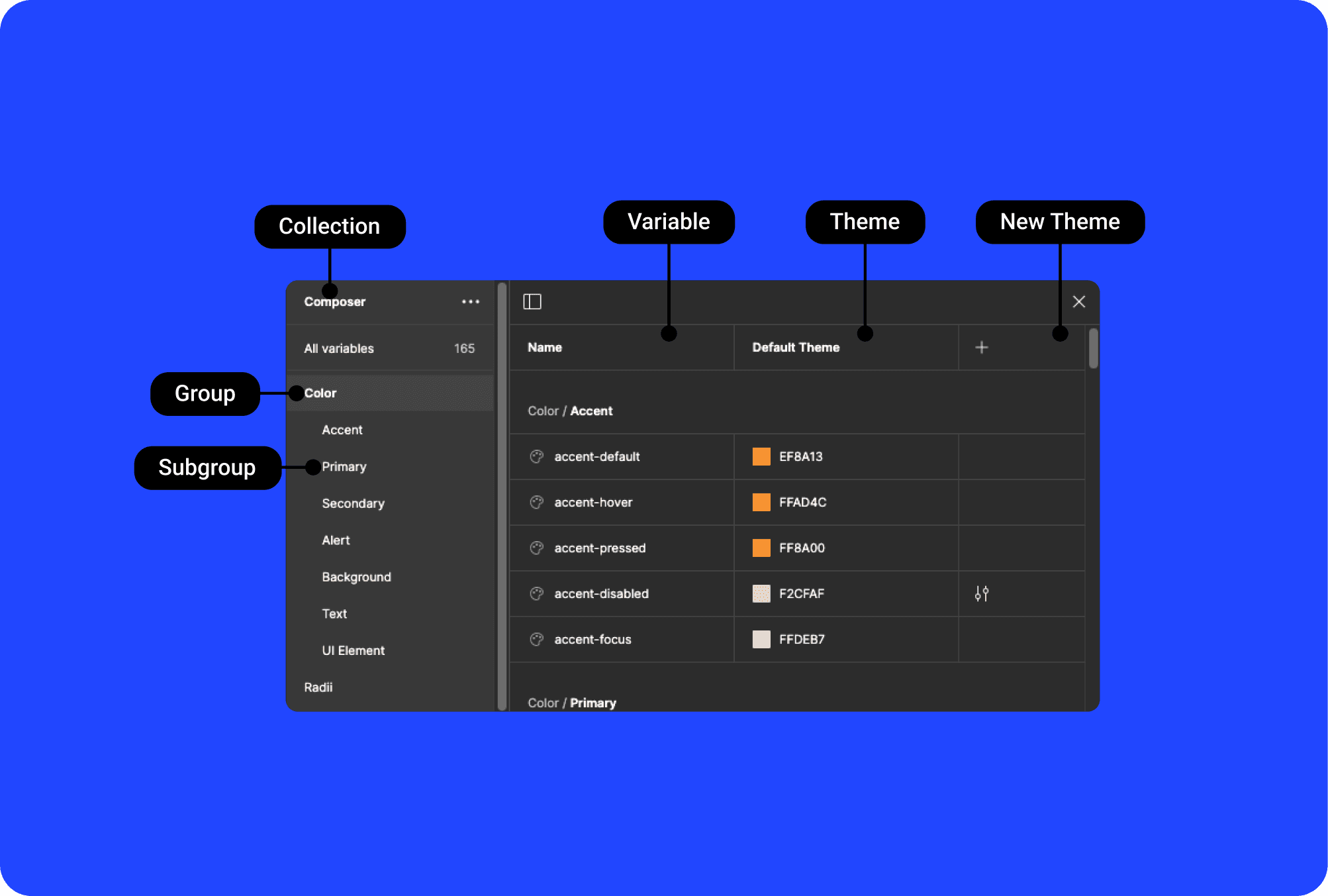
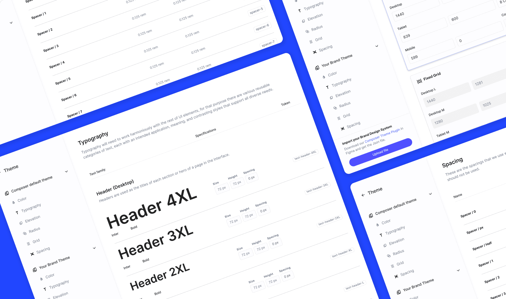
Crafted Composer’s visual identity and developed its design system from the ground up. I established foundational design tokens (colors, typography, elevations) and built flexible components that could easily adapt to diverse brands and themes, powered by Chakra UI and React frameworks.
Team Leadership & Management
Guided the team through a seamless transition from Sketch to Figma, hosting hands-on workshops to highlight the platform's collaborative strengths. Mentored two junior designers, ensuring best practices were followed in every aspect of component creation and system evolution.
Cross-Functional Collaboration & Documentation
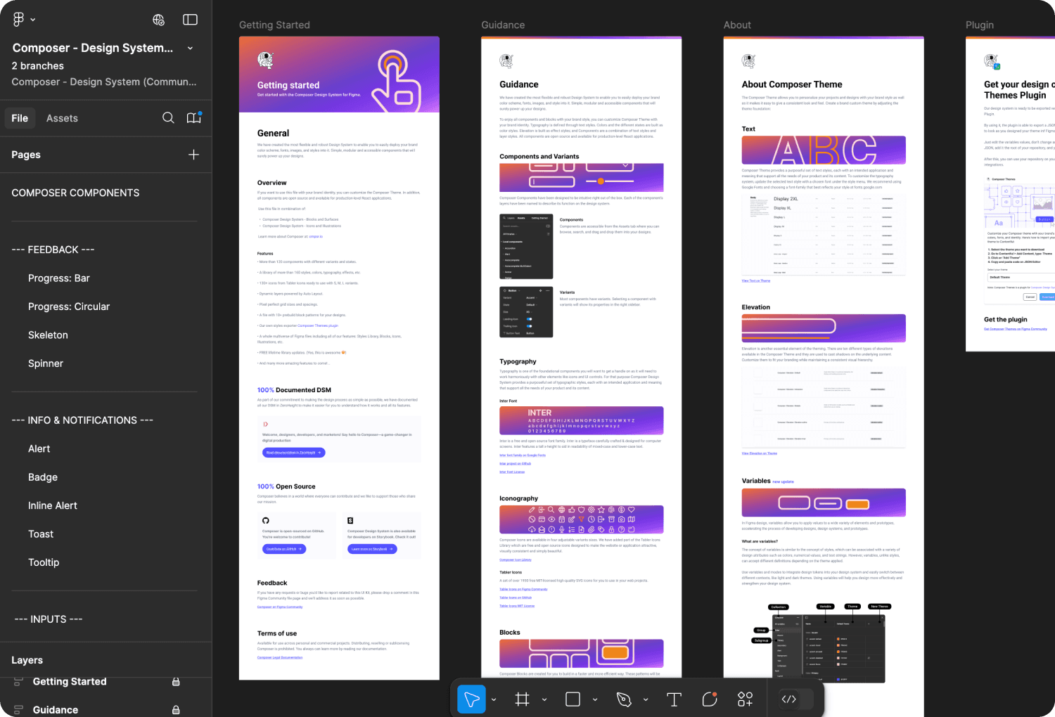
Partnered closely with developers to align design with code, creating a seamless bridge between Figma components and React implementation. I also designed a clear and accessible documentation system via Figma and ZeroHeight, ensuring teams had everything they needed to succeed.
System Maintenance & Continuous Improvement
Maintained and evolved Composer by updating components with new Figma features and user feedback. I continually refined and expanded the system to meet the growing needs of designers and developers while ensuring accessibility and scalability remained at the core.
Challenges and solutions.
Building Composer came with its share of challenges, each turning into an opportunity to refine and strengthen the system. In this section, I’ll highlight key obstacles we faced and the creative solutions we implemented to overcome them, ensuring the design system was scalable, flexible, and effective.
Ensuring Scalability Across Diverse Brands
Developed a robust design token system and flexible component architecture, enabling easy theming and customization without compromising consistency.
Transitioning the Team from Sketch to Figma
Led hands-on workshops to educate the team on Figma’s advantages, emphasizing collaboration features and design system management tools.
Promoting Adoption Across Teams
Advocated for the design system’s value through clear documentation, regular knowledge-sharing sessions, and open feedback loops with designers and developers.
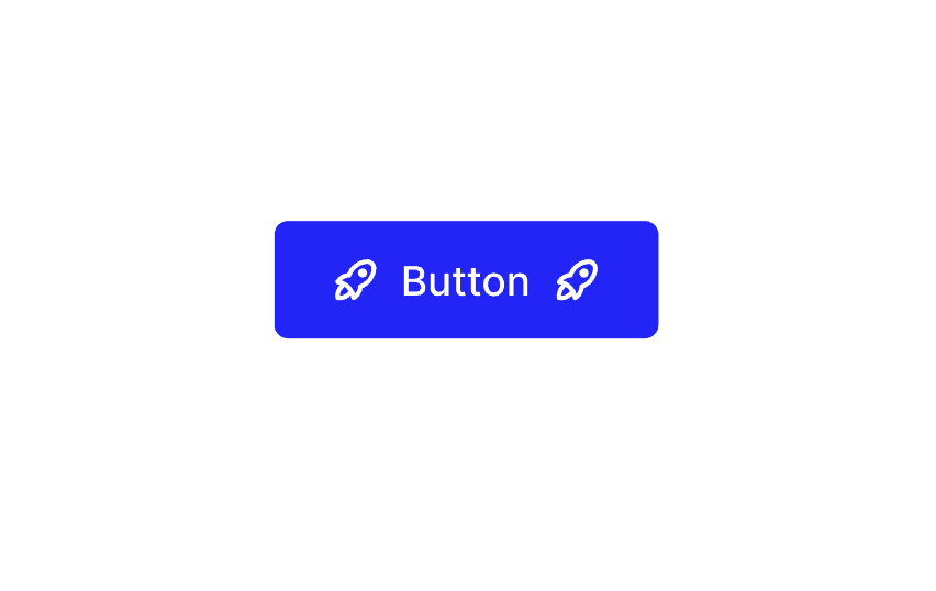
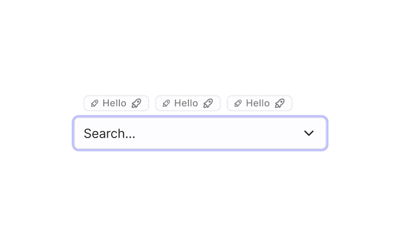
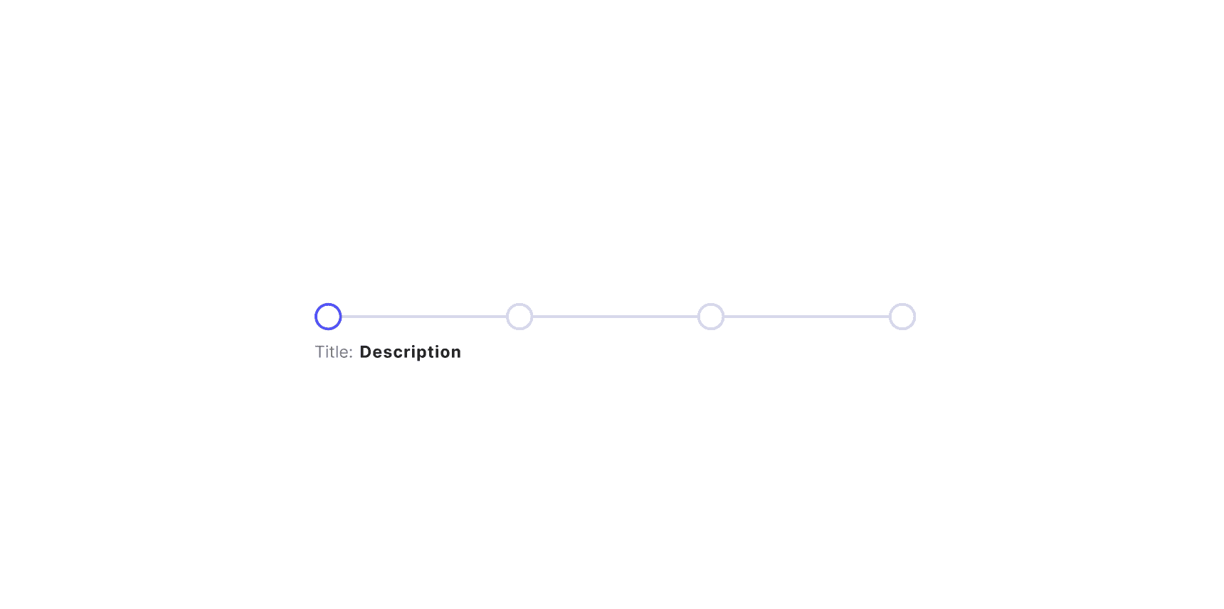
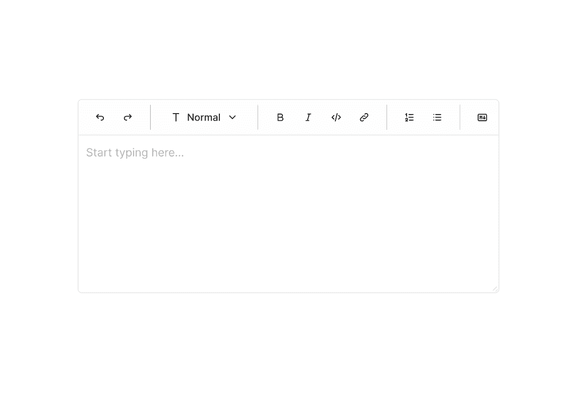
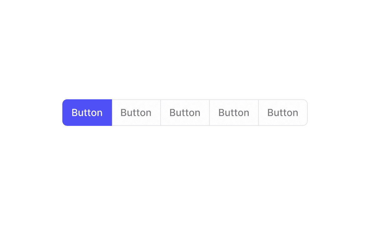
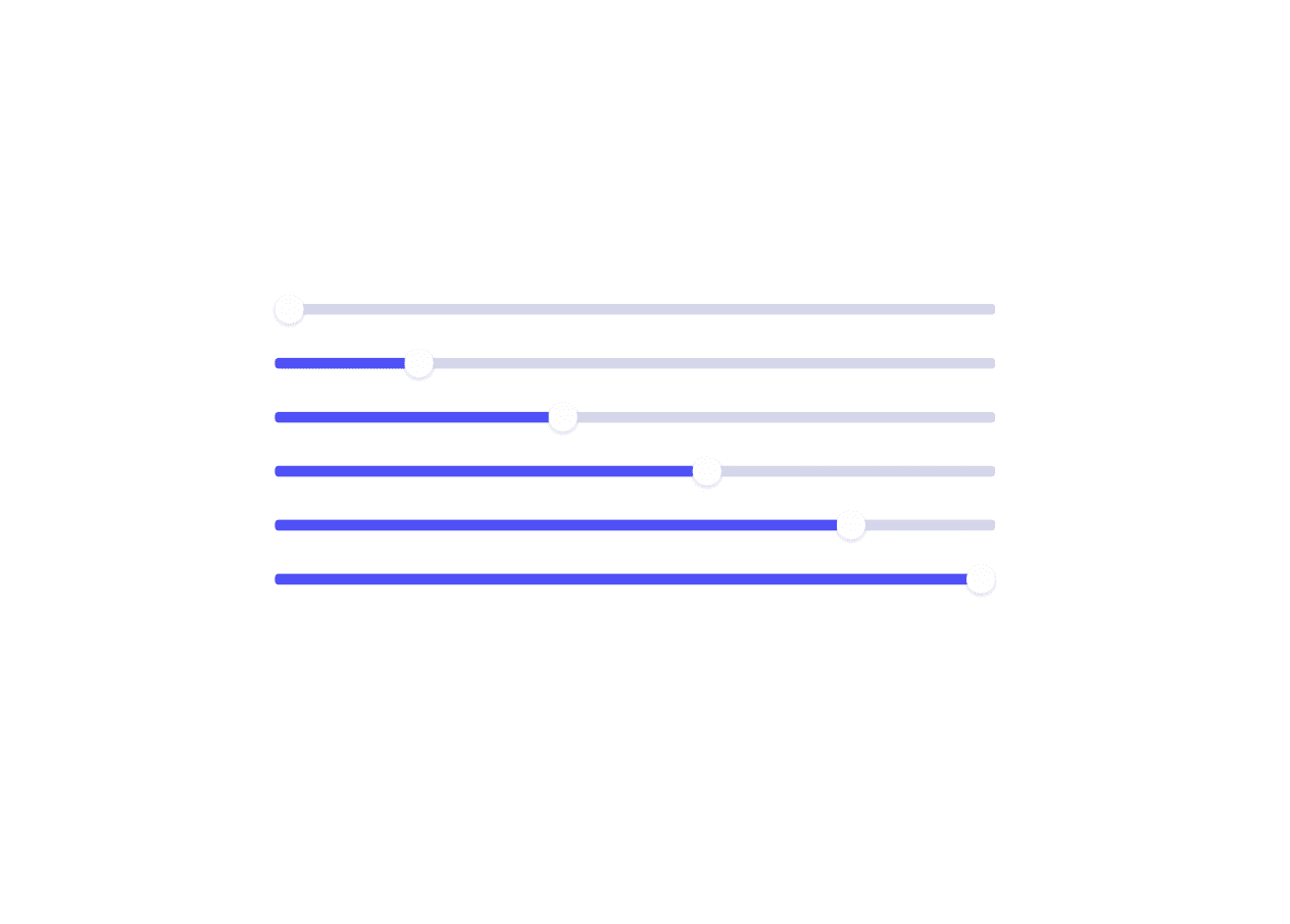
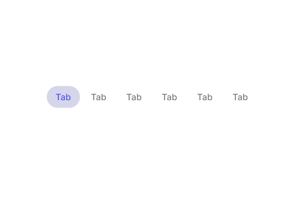
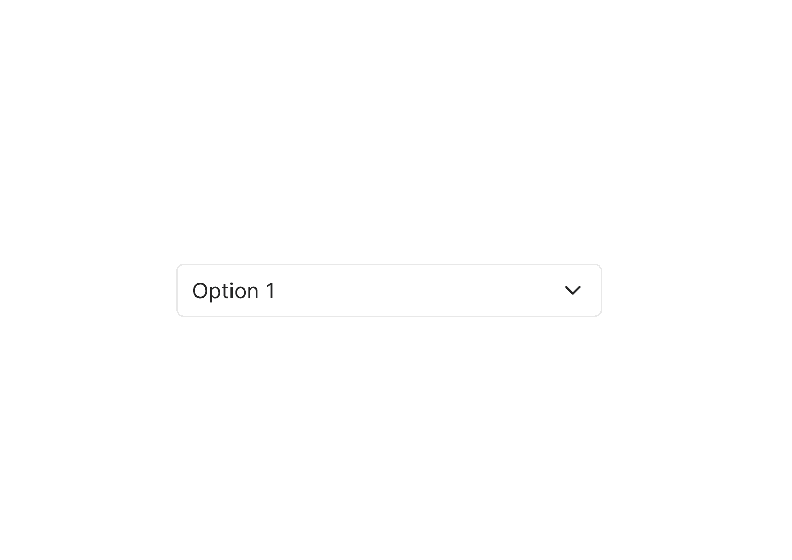
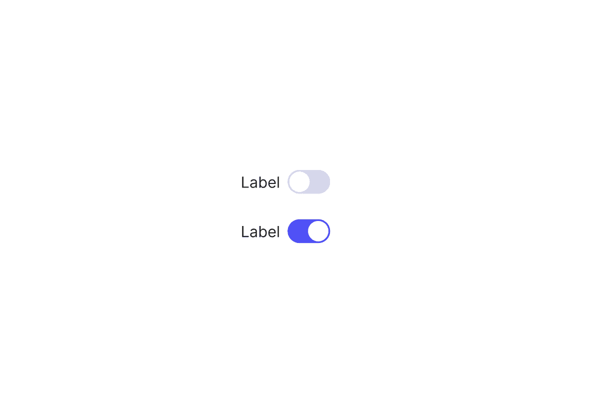
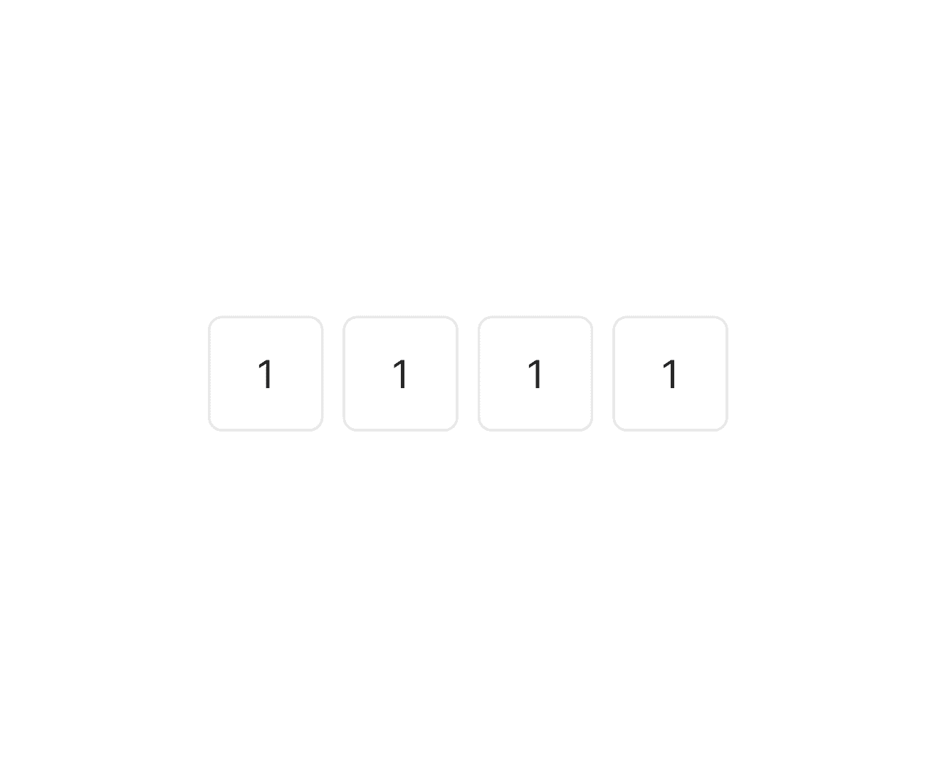
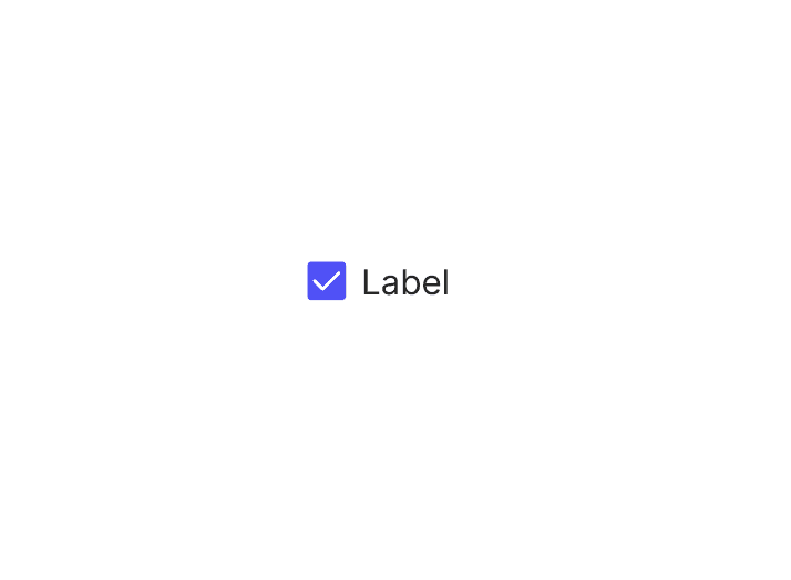
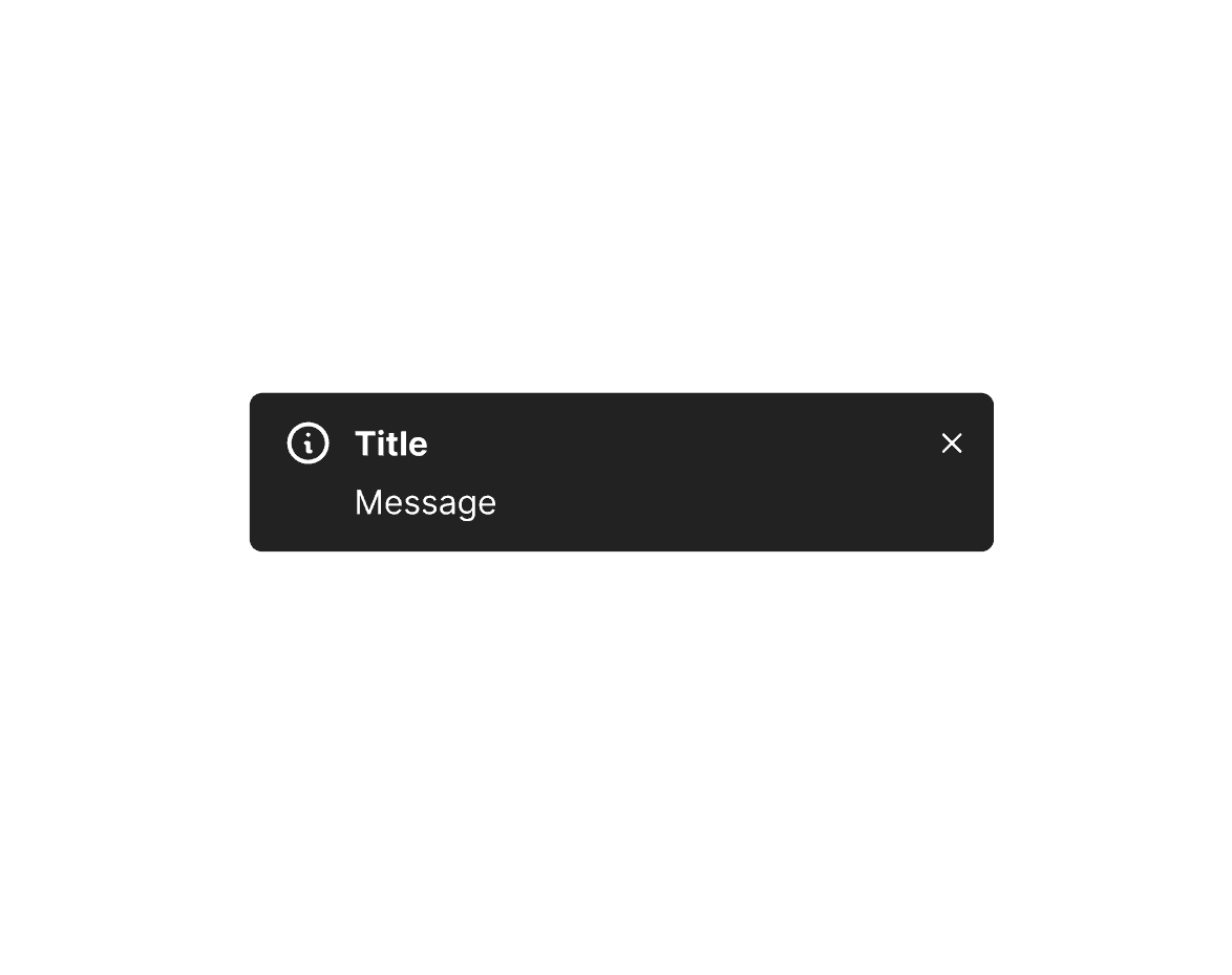
Composer components.



Key learnings.
Through building Composer, I gained valuable insights into the importance of collaboration, iteration, and clear communication. These lessons helped shape a design system that’s not only functional but also adaptable, scalable, and easy to adopt across teams.
The power of documentation
Clear, accessible documentation was crucial for cross-team adoption and long-term scalability.
Iterative feedback is essential
Regular feedback from designers and developers refined the system, ensuring it met real-world needs.
Advocacy drives adoption
Promoting the system’s benefits through workshops and consistent communication helped embed it into the team’s workflow
Visit Composer.

Github
Composer's open-source code is available for all developers,
Figma
Composer's Library is available for all designers.
Zeroheight
Composer's carefully documented for everyone.